

In the relentless competition of the Singaporean market, invisibility is a death sentence for ambition. Does your brand presence feel fractured-a patchwork of ideas that fails to command respect or capture attention? You are not just being overlooked; you are being erased. This disconnect stems not from a lack of potential, but from the absence of a strategic weapon: a masterfully architected visual identity design. It is the silent language that communicates your authority, your vision, and your right to lead before you even say a word.
Forget merely competing. This is not another article about choosing colours or fonts; it is your strategic blueprint for market domination. We will deconstruct the very architecture of a powerful visual system, moving far beyond a simple logo to build a cohesive identity that makes your brand distinct, memorable, and magnetic. Prepare to discover how to transform your SME from just another competitor into an undeniable market leader. It’s time for your brand to rise.
Key Takeaways
- Move beyond the logo; learn how to wield your visual identity as the tangible expression of your core brand strategy and market ambition.
- Discover how elements like colour and typography are not a checklist, but interconnected tools used to architect a unified and commanding brand story.
- Master a strategic visual identity design process that transforms creative output into a definitive blueprint for pioneering your category in the competitive Singapore market.
- Understand why implementation is the critical final step; learn to establish brand governance that ensures your visual identity remains a consistent and powerful asset.
Beyond the Logo: What a Visual Identity Truly Represents
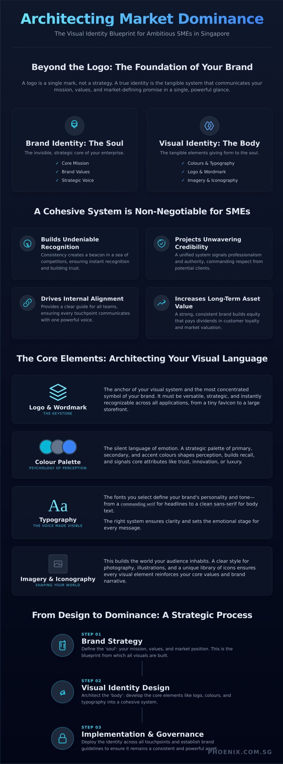
Why do so many brands fail to rise above the noise? They confuse a symbol for a strategy. A logo is not your brand; it is a single mark. To build your entire presence on it is to construct a fortress on a grain of sand. A true visual identity is far more profound-it is the tangible, sensory manifestation of your brand’s core purpose.
This is the system that communicates your mission, values, and market-defining promise in a single, powerful glance. Think of your brand strategy as an architect’s blueprint for a skyscraper. The visual identity design is the steel, glass, and concrete-the very structure that makes the vision a physical, undeniable reality for the world to witness.
Visual Identity vs. Brand Identity: The Crucial Difference
To architect a brand that dominates, you must first understand its two core components. Your Brand Identity is the soul of your enterprise-the invisible core of your mission, values, and strategic voice. In contrast, your Visual Identity is the body. It is the tangible collection of colours, typography, and imagery that gives that soul a form people can see and feel. This distinction is critical because it forms the foundation of a coherent corporate visual identity, which must be forged from strategy, not just aesthetics.
Why a Cohesive System is Non-Negotiable for SMEs
In the hyper-competitive Singaporean market, a fragmented visual presence is a death sentence. A cohesive system of visual identity design is not a luxury reserved for giants; it is a mandate for any SME determined to not just compete, but to lead. It is the engine of your brand’s ascent.
- Builds Undeniable Recognition: In a sea of competitors, consistency creates a beacon. It ensures your audience recognises you instantly, building the trust necessary for market leadership.
- Projects Unwavering Credibility: A unified visual system signals professionalism and stability. It commands respect and tells potential clients you are a serious, authoritative force.
- Drives Internal Alignment: It provides a clear guide for all teams, ensuring every touchpoint-from a sales deck to a social media post-communicates with one powerful, unified voice.
- Increases Long-Term Asset Value: A strong, consistent brand is one of your most valuable assets. It builds equity that pays dividends in customer loyalty and market valuation for years to come.
The Core Elements: Architecting Your Brand’s Visual Language
A dominant brand is not built on random chance; it is architected with intent. The core elements of a visual identity are not a simple checklist but an interconnected system of strategic tools. When wielded correctly, they forge a cohesive and undeniable brand story that cuts through the noise of a crowded marketplace. A masterful visual identity design ensures every asset, from a business card in Singapore to a global website, speaks with one powerful voice. These components are the very language your brand uses to communicate its purpose, personality, and promise.
Logo & Wordmark: The Keystone of Your Identity
The logo is the anchor of your visual system-the most concentrated symbol of your brand. It must be forged for longevity, not fleeting trends. Whether it’s a symbolic mark, a typographic wordmark, or a combination, its power lies in its versatility. A truly strategic logo is instantly recognisable whether it’s a tiny favicon on a browser tab or emblazoned on a physical storefront, serving as the keystone for your entire brand narrative.
Colour Palette: The Psychology of Perception
Colour is the silent language of emotion. Your palette-comprising primary, secondary, and accent colours-is a strategic tool for shaping perception and building recall. Each hue carries deep psychological and cultural associations that can signal trust, innovation, or luxury. Defining and consistently applying this palette across all touchpoints is non-negotiable; it’s how your brand becomes instantly recognisable in a split second.
Typography: The Voice Made Visible
If your brand had a voice, typography would be its tone. The fonts you select-from a commanding serif for headlines to a clean, legible sans-serif for digital text-define your brand’s personality. Is it traditional and authoritative, or modern and approachable? The right typographic system ensures clarity and sets the emotional stage for every message, transforming mere words into a powerful statement of identity.
Imagery & Iconography: Shaping Your Brand’s World
This is where you build the world your audience inhabits. A cohesive visual identity design dictates a clear, intentional style for all assets. This includes defining a photographic approach (e.g., candid and authentic vs. polished and aspirational) and creating a unique library of icons and illustrations. Every visual element must be a deliberate brushstroke that reinforces your core values and shapes a world that is unmistakably yours.
The Strategic Design Process: A Blueprint for Market Makers
A common misconception is that design is a purely creative pursuit. At Phoenix Design, we see it as a calculated act of market creation. The process of building a visual identity is not about choosing colours; it’s about architecting a legacy. We don’t just design brands; we forge market pioneers. This strategic journey reshapes perception, dismantles competition, and establishes your brand as the undeniable leader in a category of its own making.
Phase 1: Discovery & Strategy
Every rebirth begins with a clear vision. This foundational phase is where we move beyond your product to define your purpose. We deploy our proprietary Category Hack Blueprint™ to map out an uncontested market space for you to own. This isn’t about fitting into the crowded Singaporean landscape; it’s about reshaping it. We meticulously analyse:
- Market Category Definition: Pinpointing the unique space your brand can exclusively dominate.
- Competitor Intelligence: Deconstructing competitors’ visual strategies to identify their weaknesses and our opportunities for differentiation.
- Audience Resonance: Defining your ideal customer and the core message that will command their loyalty.
Phase 2: Concept & Creation
With strategy as our compass, we ignite the creative fire. This is where abstract market positioning is translated into a tangible visual language. We develop multiple conceptual directions, each a potential future for your brand. The chosen path isn’t based on aesthetic preference but on strategic alignment. This is where our expert visual identity design moves from theory to reality, forging the core assets-logo, typography, colour palette, and imagery style-that will become your brand’s signature. Every element is refined to ensure it communicates authority, innovation, and category leadership.
Phase 3: Systematization & Guidelines
A powerful identity is useless if it cannot be wielded effectively. In this final phase, we systematize your brand’s visual power into a comprehensive set of guidelines. This is your brand’s doctrine, ensuring every touchpoint, from a social media post to a major campaign, is executed with unwavering consistency and impact. We equip your team with practical templates for key marketing materials, empowering them to deploy the new identity flawlessly. This isn’t just a rulebook; it’s the operational manual for your market dominance.
Your brand was not born to compete; it was born to lead. Ready to architect your brand’s future? Begin your rise. 🔥
From Design to Dominance: Implementation and Governance
A visionary visual identity can falter and fade into obscurity. Why? The most common point of failure is not the design itself, but its inconsistent application. A powerful visual system is not a static asset to be filed away; it is a living, breathing entity that must be governed with strategic precision. Without disciplined implementation, even the most potent visual identity design dissolves into a chaotic and forgettable mess, undermining the very market dominance you seek to achieve.
True brand power is forged in consistency. It’s the relentless, unified application of your identity across every interaction that transforms a great design into an undeniable market presence. This is where governance becomes the architect of your legacy.
The Power of Brand Guidelines
View your brand guidelines not as a restrictive rulebook, but as a blueprint for empowerment. It is the single source of truth that enables your team, partners, and agencies in Singapore to create with speed and confidence, ensuring every single output reinforces your brand’s core. A comprehensive guide must architect every detail:
- Logo Usage: Unambiguous rules on clear space, minimum size, and explicit examples of incorrect usage to prevent brand dilution.
- Colour & Typography: Precise colour codes (CMYK, RGB, HEX) and a defined typographic hierarchy that ensures clarity and brand personality.
- Imagery & Voice: Clear direction on photographic style, illustration, and tone of voice to create a cohesive emotional experience.
Ensuring Consistency Across All Touchpoints
Your brand must present a unified front wherever it appears. This discipline builds invaluable brand equity, making you instantly recognisable and trusted. From the first click to the final handshake, every touchpoint must be perfectly aligned. This includes your website and social media channels, sales presentations and proposals, and physical assets like packaging and office interiors. Each element is a building block in your ascent to market leadership.
Evolving Your Identity Without Losing Recognition
Markets shift, and brands must evolve. The challenge is to adapt without erasing the equity you’ve painstakingly built. A brand refresh is a strategic evolution of your existing visual identity design to stay relevant, while a full rebrand signals a fundamental transformation of your business. The decision must be strategic, not reactive. By retaining core brand elements-a signature colour, a unique typographic trait-you can orchestrate a powerful rebirth that feels both fresh and familiar, guiding your brand’s next chapter of growth. Ready to build an identity that endures? Begin your rise.
From Blueprint to Market Dominance: Architect Your Ascent
We have established that a truly powerful visual identity design is not a mere collection of assets, but the strategic architecture of your market presence. It is the visual language that communicates your authority and the disciplined system that transforms brand perception into undeniable preference. This strategic journey, from core elements to flawless implementation, is what separates fleeting businesses from enduring market icons.
For Singapore’s ambitious SMEs, simply competing is no longer the endgame. The goal is to create and dominate. As specialists in brand transformation, we guide businesses from obscurity to leadership. Our strategic approach, powered by the proprietary Category Hack Blueprint™, engineers your entire brand ecosystem-from foundational positioning to resonant visual execution-to reshape your category.
Your brand’s rebirth starts here. Become a market maker.
Visual Identity Design: Your Questions Answered
What is the difference between a logo and a full visual identity?
A logo is a single, powerful mark-the face of your brand. But a visual identity is the entire strategic ecosystem it lives in. It is the architecture of your brand’s presence, encompassing typography, colour palettes, imagery style, and application rules. Think of a logo as a signature; the visual identity is the unmistakable handwriting that ensures your brand is not just seen, but felt and remembered across every single touchpoint, creating an undeniable presence.
How much does professional visual identity design cost for an SME in Singapore?
For a Singaporean SME ready to command its market, this is a strategic investment, not a mere cost. A comprehensive project typically ranges from S$8,000 to S$25,000+, depending on the strategic depth and scope required to architect your market dominance. This investment forges a complete system for recognition, transforming your business from just another competitor into an undeniable category pioneer. It is the price of true differentiation and authority in a crowded landscape.
How long does it take to develop a complete visual identity system?
Architecting a truly transformative visual identity system is a meticulous, strategic process. A complete project, from initial market immersion and brand strategy to final asset delivery and guidelines, typically requires 6 to 12 weeks. This deliberate timeline ensures we build a robust, future-proof foundation for your brand’s rebirth. It allows for the deep strategic alignment needed to craft a visual language powerful enough to reshape perceptions and secure your leadership for years to come.
Why can’t I just use a cheap online logo maker?
An online logo maker produces a generic mark; it cannot architect a brand’s soul. These tools offer templates used by thousands, ensuring your brand remains invisible and forgettable. They lack the strategic depth, cultural insight, and unique narrative required to build a legacy. To pioneer a new category, you need a bespoke visual system born from deep strategy, not a disposable graphic. Choosing a template is choosing to blend in; we empower you to dominate.
Do I really need a brand style guide for my small business?
Absolutely. A brand style guide is not a luxury; it is the strategic blueprint for your brand’s consistent expression and market dominance. For a small business with ambitions to rise, it is non-negotiable. This guide empowers your entire team, freelancers, and partners to execute your vision flawlessly across every platform. It ensures every touchpoint reinforces your brand’s power and authority, accelerating your journey from an unknown entity to an unforgettable market leader.
How does visual identity connect to getting an EDG grant?
In Singapore, the Enterprise Development Grant (EDG) is designed to fuel business transformation. A professional visual identity design project falls directly under the grant’s “Strategic Brand & Marketing Development” pillar. A well-defined project that aims to strengthen your brand’s market position and international readiness is precisely what the EDG is designed to fund. Investing in a strategic visual identity is therefore a government-endorsed pathway to elevate your business and unlock its global potential.